
Handshake App
Handshake is a fictional app that allows freelancers and clients to manage, track, and budget projects. It was the foundation for my practice exercises throughout the UX Writers Collective Fundamentals course. The idea behind the final project was that I, the UX writer, was tasked with reviewing and touching up the text in a series of UI mockups before a design presentation. Screenshots of the mockups before and after my contributions are included throughout.
Setup Flow
Approach
Setup flows are meant to welcome both new and continuing users. As you can see in the mockup screenshots before my edits, there is certainly the skeleton of a flow here. Unfortunately, there would be a number of issues if a user were to actually try interacting with the setup flow in this state.
At first glance, I knew there were issues with buttons. I understood that buttons should only have a few words and should give the user an idea of what might happen when they tap the button. The buttons and microcopy are either vague about what will happen next or are overcomplex. If you take a hard look at the second screen, there isn't a way for the user to proceed after entering their email and password to log in or set up a new account.
The last two screens mostly just need microcopy edits to better characterize the app. Visually, the buttons in the final screen could be similarly colored to the other buttons so that they can better stand out from the background.
Headings and subheadings were inconsistent and there weren't enough headings to provide clarity about a section of the screen - with the second screen being the main offender.
I also thought the design was lacking functionality in a few key places. Buttons are needed in the second screen to allow the user to confirm the creation of their account or to log in. These issues would be worth mentioning to the UX team.
Overall, a lack of voice and functionality are the main issues here.
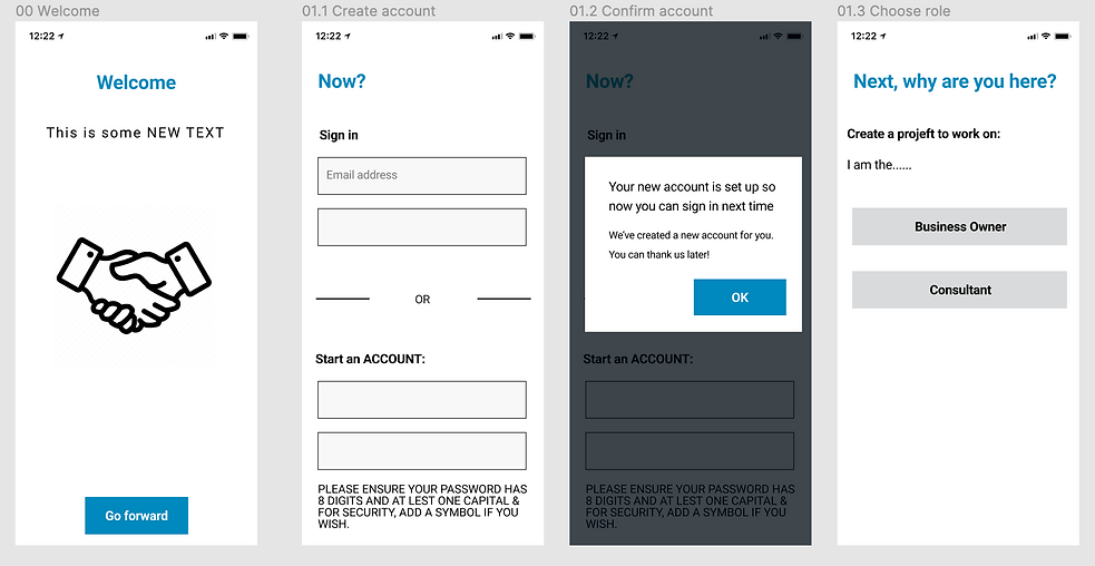
BEFORE: This was the setup flow before I was tasked with making edits.

AFTER: The setup flow after I made some simple design edits and added my microcopy edits.
Contribution
After thinking through all of the problems seen in the original mockup screenshots, I made sure to pay close attention to how everything on-screen would affect the user - primarily the app's voice. The original flow was flexing tone and voice, but not in ways that could help make the user feel comfortable and welcomed.
To start with the welcome screen, I included the app name in the welcome heading, (which is a must-have). It's a good thing to establish app identity for the user this early in the app experience.
The first heading in screen four, "Next, why are you here?", sounds interrogative and annoyed. To avoid rubbing our users the wrong way, it should sound more welcoming.
On the topic of app identity, It was important for me to include some brief marketing microcopy so that the user gets a taste for what they're about to get into.
The microcopy on the third screen was too long, so I clarified it and made it feel more engaging.
Buttons were changed entirely and added in some places. "Go forward" on the first screen makes sense, but doesn't reflect brand voice. "Get Started" is clearer, friendlier, and gives the user an idea of what will happen next.
The fourth screen needed slight changes to its diction and voice to match our friendly and knowledgeable app style.
Lessons Learned
Although the setup flow is only the beginning of the onboarding flow and user journey, it can make or break the user experience. I made sure that the user's first steps in this app would be stress-free and inviting. I've learned that UI elements like buttons and headings aid in the process of making the app more accessible.
Onboarding Flow for Freelancers and Clients
Approach
Similar to the setup flow above, the voice and tone are all over the place in the onboarding flow. There are places where the headings and microcopy should take the sensitivity of the information into account (budgets, project details, payment methods, etc).
Each screen seems pretty bare and could use more microcopy to guide the user.
The buttons are labeled inconsistently and don't give the user a good idea of what will happen if they tap them, with "Go" being the worst of the bunch (go where?).
The headings also need to welcome users on both sides of the app.

BEFORE: This was the client onboarding flow before reviewing and editing it. All of the text in this screenshot was written by the UX designer.

BEFORE: This was the freelancer onboarding flow before reviewing and editing it. All of the text in this screenshot was written by the UX designer.

BEFORE: Setup confirmation screen after you've invited the client/freelancer.
Contribution
After reviewing the mockups, I knew that style had to be established. This was a major priority.
To start, I made sure that the headings and subheadings were consistent. H1 needed to either be questions or commands to label each screen and guide the user. Subheadings were absent above a few input fields. A few were added and others were simplified: "Your rate of pay per hour" -> "Your hourly pay rate." This is cleaner.
Button microcopy was made uniform using title case and were edited to match the flow of actions. Words like "Go", "start", and "send" were a bit vague. The user may not have a clear enough idea of what is going, starting, or being sent. "Next", "Set Up", and "Invite" are fitting replacements since they're a little clearer about their actions. "Next" lets the user know that there we're progressing forward but there's still more to be done. "Set Up" and "Invite" were simply borrowed from the H1's of their respective screens. My thinking was that if the user is tasked with setting up their bank info, then they expect their task to be confirmed with a button labeled with the same action. As we're inviting another user, my thinking behind the "Invite" button was the same.
I added tooltips and hint microcopy on both sides of the onboarding flow. Without those, the user may have been confused about which details to add or what might come next after inviting their freelancer.
Lessons Learned
I learned that tooltips and hint text are especially useful, but not if they're inside form fields. Though it may look cleaner, users might have trouble remembering what information they need to enter if they get distracted.
This was also a good lesson in understanding the utility of buttons. They are meant to echo the action mentioned in the heading with a similar verb.

AFTER: The client onboarding flow after I made some simple design and microcopy edits.
AFTER: The freelancer onboarding flow after I made some simple design and microcopy edits.


AFTER: Setup confirmation screen after you've invited clients/freelancers.
Approach
The ongoing use and message center are where our users will spend most of their time and is arguably where our user journey plateaus. They'll want to communicate with project partners, track projects, and pay bills smoothly. Clear and purposeful UX writing and design is important in shaping the user's willingness to stick with the app. We need to prove to the user through strong voice and tone that the app respects their time and needs. Importantly, we want to prevent users from getting frustrated, deleting the app, and moving on.
The main issues in these mockups are similar to other user flows above - mostly problems of tone, voice, and clarity. Button text, headings, help text, empty states, confirmation screens, dialogs - everything here needs to be edited for consistency.
BEFORE: This was the client onboarding flow before reviewing and editing it. All of the text in this screenshot was written by the UX designer.
BEFORE: This was the freelancer onboarding flow before reviewing and editing it. All of the text in this screenshot was written by the UX designer.
Ongoing Use and Message Center

BEFORE: Ongoing use and message center screens for the client.

BEFORE: Ongoing use and message center screens for the freelancer.
Contribution
As I mentioned above, the main issue here has to do with a lack of style and consistency. It was time to get to work.
To start, the navigation buttons at the top of the screen were labeled accurately apart from the "Time" section. The user could guess what "Time" means, but we don't want to leave them in that position. Instead, "Hours" made more sense because clients and freelancers track and count the number of hours worked on a project.
Headings were reworked throughout the mockup to be tonally consistent. Headings like "Are you for sure?" and "Put in new hours for Week 4" were changed to "Cancel invoice?" and "Track Hours for Week 4". These changes help the app sound like it takes itself seriously. It would be fitting for an app that handles money and high-stakes projects to come off as friendly and knowledgeable, but not casual and carefree.
Action buttons like "Pay that", "OK", and "Open It" are too vague. "Pay that" was simply changed to "Send", "OK" in the first screen was changed to "Back", and "Open It" was changed to "Reply". My thinking behind these changes was that they needed to function as the user is expecting them to. "Send" makes more sense, since the user is sending money to a freelancer. "Back" instead of "OK" allows the user to actually return to the main menu instead of feeling like they are confirming information. The user hopes to view a message and reply to it when they tap the message, so "Reply" fits well here.
The microcopy in the confirmation screen dialogs in the client and freelancer flows were unclear and wouldn't allow the user to return to the previous menu. "Hope you didn't make a mistake..." is, unfortunately, a poor example of UX writing. Phrasing like that can make the user feel guilty and unsure of their actions. "You’re about to send a payment of $1200 to Kelly. Ready to send?" give the user all of the information they need before confirming it. The tone of "Boom!!! You're done! Your request for more money is on its way" is too excited and careless for the situation here. We just want to notify the user that their request has been sent, so it's better to use straightforward language: "Your invoice for Week 3 is on its way to Tom. Once paid, it should arrive in your bank account in 1-3 business days."
Lessons Learned
The ongoing use and message center were probably the most challenging of the three flow mockups. The user has every reason to give up on an app at this point if it's too hard to use, doesn't explain directions well, or makes them feel unsure about their actions. At this point in the user journey, they need to feel comfortable performing routine tasks without any obstacles. If the client has trouble understanding where to send their payments to freelancers, then that's a serious blocker that the UX team needs to address.
Keeping headings, terminology, and voice consistent should create a sense of familiarity for the user. This should help to prevent users from distrusting the app.

AFTER: Ongoing use and message center screens for the client.

AFTER: Ongoing use and message center screens for the freelancer.
Final Thoughts
If I can take away one essential nugget of wisdom from my UX writing course and this final project, it's that UX writing is all about the user. We must remember the user in all aspects of writing, design, and programming. UX writers and their teams must be the flag bearers of accessibility, readability, and scannability in our work.
Does the microcopy guide the user well enough? Do the designs seem inconsistent with others? Does a component not work properly or efficiently enough? These are the questions that UX teams need to ask and research to prevent road bumps in the user journey.
As a UX writer, my greatest fear is that a user would give up during their journey, but I'm driven to prevent that from happening through consistent, clear, and subtle microcopy.